Texas Dow Employees Credit Union
A not-for-profit financial cooperative that provides banking services, prioritizing member benefits over profits.

Overview
Over the years, TDECU's customer-facing website and user portal had undergone multiple design and development iterations, resulting in a fragmented and inconsistent user experience. A comprehensive overhaul was necessary to unify the brand and improve usability.
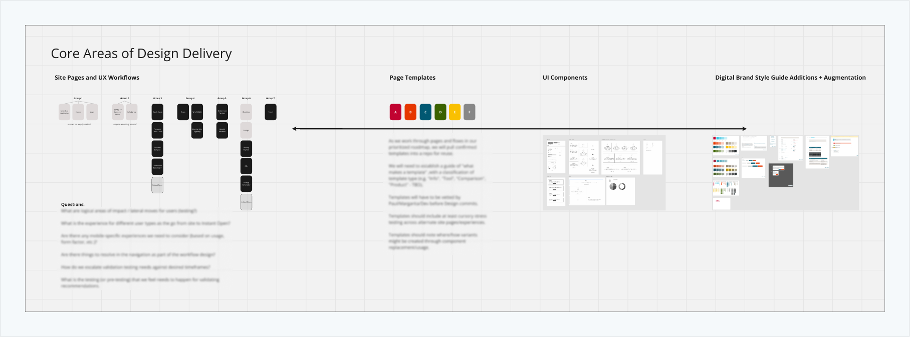
Working with Daito Design we did a design review of the website, a brand refresh, updated and significantly expanded the design library, streamlined the information architecture (IA), introduced new templates, created a content guide and enhanced the usability of each page
Our goal was to create a more intuitive and user-friendly experience.
1. Design Review
In collaboration with Daito Design, we conducted a thorough audit of all digital assets and brand guidelines to identify areas for improvement.
As part of this process, we categorized the website’s pages by product type, identifying the most critical: the Rates page. This page became the foundation for setting the design direction for the site.


2. Brand Refresh
During the redesign, we uncovered several usability issues related to color and typography. Working with the TDECU design team, we explored ways to refresh TDECU’s brand without changing its essence. These changes helped enhance both accessibility and visual cohesion.


3. Design Library
With updated brand standards in place, we began building a comprehensive design system. This involved auditing and revamping all design elements and components to ensure they aligned with the new branding, creating a unified visual language across all digital touchpoints.
To maintain consistency between design files and the live TDECU website, built on a CMS platform, we developed an extensive “Add-on” library. Collaborating closely with developers, these Add-ons were integrated into the CMS, enabling seamless page generation and updates while preserving visual consistency across the site.


4. Information Architecture & Website Update
TDECU offers a wide range of products, so to update the site effectively, we grouped and analyzed its pages based on product offerings. We streamlined the information architecture (IA), introduced new templates and enhanced the usability of each page. Our goal was to create a more intuitive and user-friendly experience.

5. Content Strategy & Website Implementation
Once the designs were finalized, I collaborated closely with developers to implement the new design system on CMS. I gained proficiency in manipulating and updating pages within the platform, contributing to an organized and efficient rollout of the updates. This process applied to both the consumer-facing site and the user dashboard.
In addition to the design improvements, we developed a content strategy guide and template to ensure consistency in the website's tone, messaging, and structure. The guide helps maintain a cohesive experience across all pages.

