Bloom
Back in 2018, I participated in the annual 36 Days of Type.
It’s really cool, a yearly call that challenges participants to design a letter or number for 36 consecutive days.
Back then I was working for a firm and designing a lot of things, but it was all corporate and not as creative as I wanted to be.
I found myself wanting to challenge myself by creating a style for every three letters or numbers.
When I got to the numbers 4-6, a flower pattern emerged.


The floral numbers were probably the set that got the most positive feedback and I had the most fun doing.
This spurred me to create something using this style, and so I made a poster.
I was really really happy with the outcome. But, it started to bother me that the two E’s were not the same, which inspired me to create a set of floral letters.
Thus began the process of trying to make a dropcaps floral set.
I started at first using Bodoni as a “base” and illustrating over it.
They looked fine, but I was not too happy with the final visual aesthetic of it.
Which led me to:
Design letters with extreme thicks and thins that could somehow be used to help the floral pattern “grow”
Create a style of illustration that I liked
A series of iterations began, 4-6 hours a letter to see if I could make a set that was worthy of being called a dropcaps.
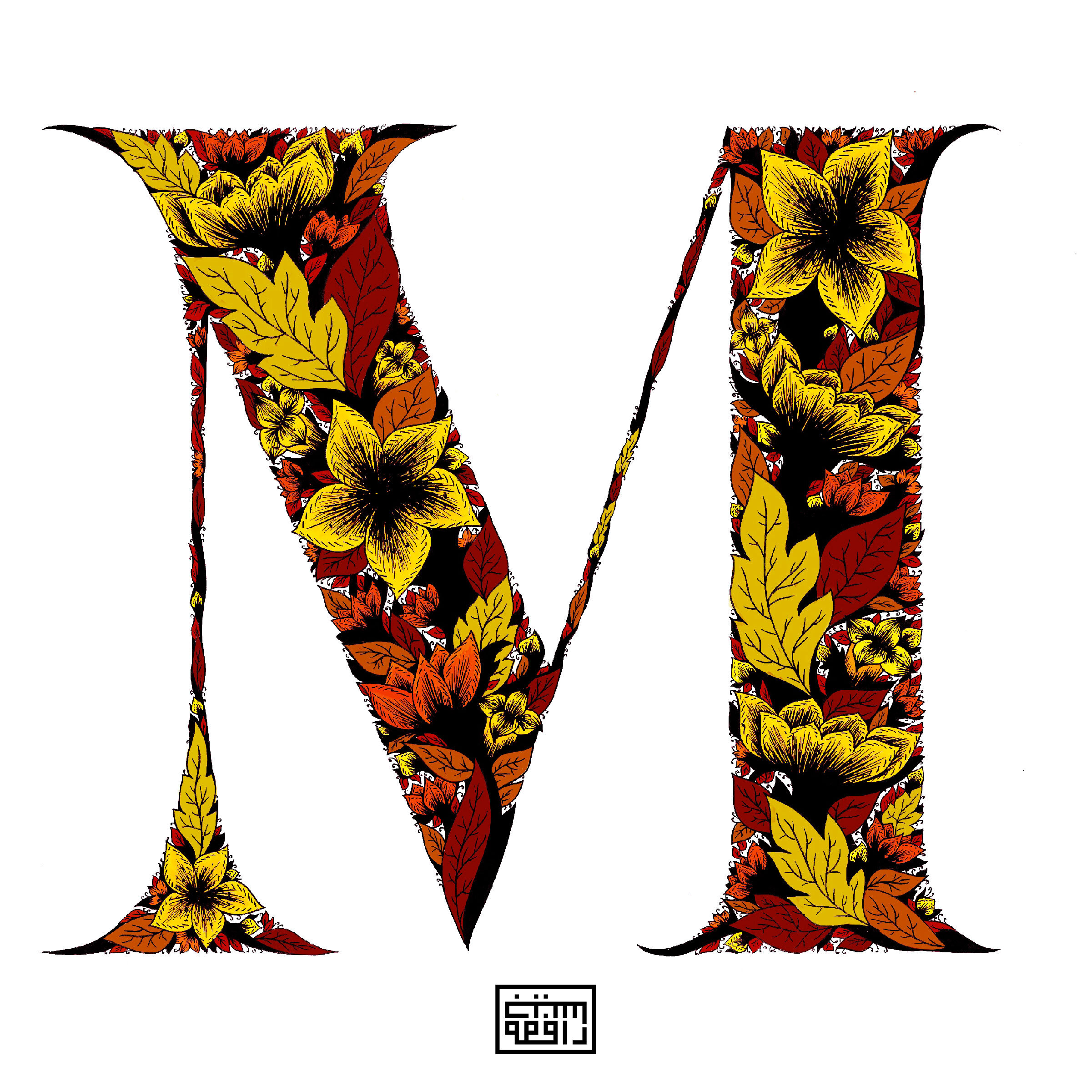
At some point I thought I was almost done so I started adding color and even did a spontaneous mini collaboration with Piergiorgio ”Bruse” Brusegan (a Venetian street artist).
Spontaneous mini collaboration with Piergiorgio ”Bruse” Brusegan (a Venetian street artist).
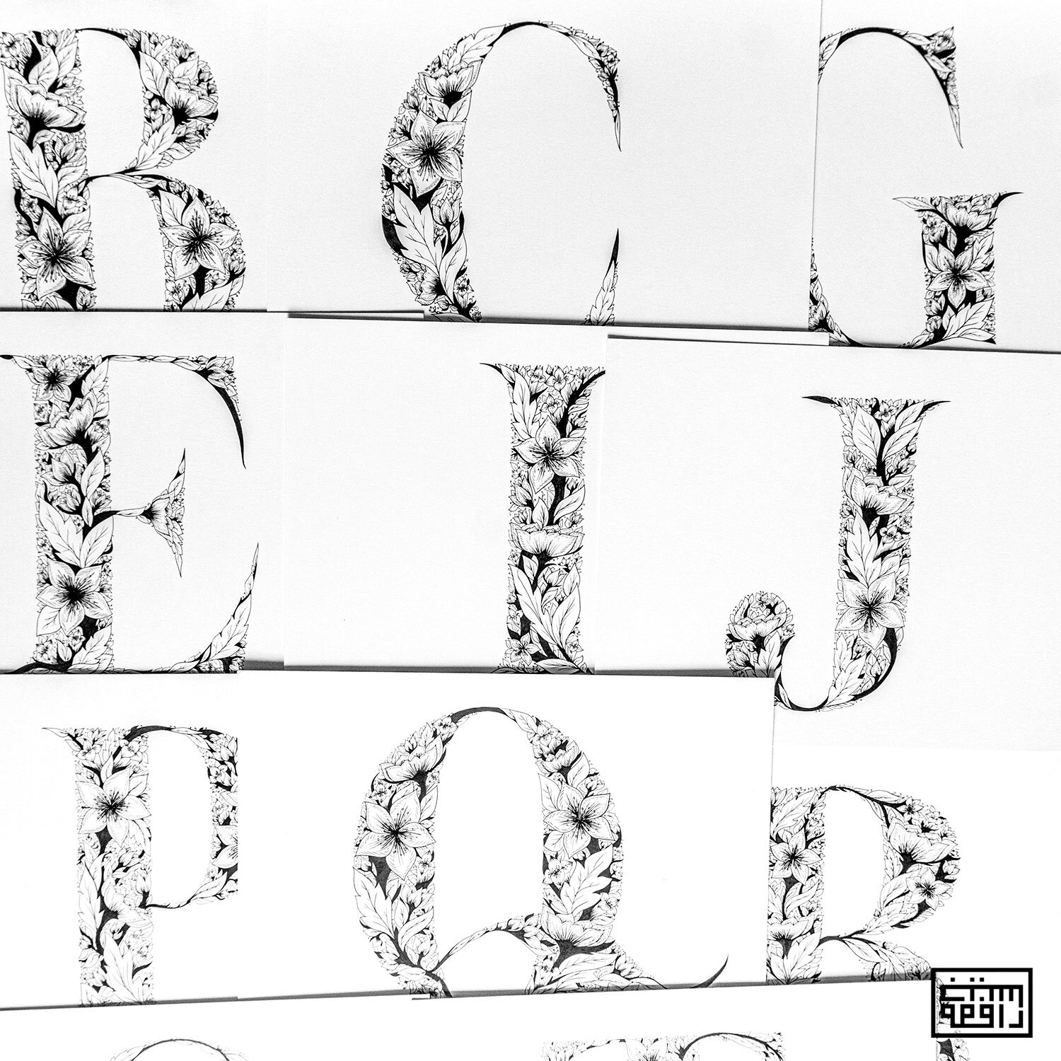


Since I was happy with the outcome and thought I was finished, I started to scan these illustrated letters.
I couldn’t help but think how cool it would be if it could be turned into a typeface.
I had the letters already designed on my computer as well as a set of illustrated hand done letters but I did not know how to convert this into a typeface.
I found and applied to the Alphabettes mentorship program.
Amazingly, I was accepted and assigned Andrei Ograda as my mentor.
So began the making of a floral typeface:
He helped me understand the mistakes I had made in the letter forms
There were too many details in the illustrations that would be lost when made smaller
Vectorizing the illustrations I had created would probably make me go insane
The vector files of the illustrations letters as they were would make the files huge and very difficult to use as a typeface
And other things of the sort.
Practical things about making a typeface that I didn’t know.
And so, another step in the creation of this typeface:
Fixing all the mistakes in the letter forms
Smaller, tiny versions of the floral illustrations
Vectorizing the floral illustrations (this was no joke, 4-5 hours for one letter, one vector point at a time)


It’s been 2 years that I’ve been working with this idea of a floral set.
It started as something random to help me be more creative in my own time which then became an obsession.
It’s still not completely ready (now that the letter forms have been fixed, I will begin again to draw the detailed hand illustrations and I still have to work on making the typeface functional), but it’s almost there.

